An overview of Jumpstart’s styling and interface elements.
Click here to see full documentation.
Primaries and grays – please note these are for demonstration purposes only
Primary
Primary 2
Primary 3
Success
Warning
Danger
Info
Dark
Body Color
Secondary
Light
White
Headings, body and other common text elements
Display 1
Display 2
Display 3
Display 4
“Here’s an insightful quote from the article that is worth isolating for emphasis.”
Lead Text Lead Link
Body Text Body Link
Small Text Small Link
Tiny Text Tiny Link
Toggle element based on the Card for displaying discrete portions of information
Integer ut Oberyn massa. Sed feugiat vitae turpis a porta. Aliquam sagittis interdum Melisandre. Vivamus ornare pharetra diam sit amet tincidunt. Eunuch sit amet pharetra odio. Vivamus in tempor ipsum, sit amet elementum neque. Sed faucibus posuere pharetra. In imperdiet eleifend dui a aliquet. Aliquam imperdiet Tyrion purus vitae rutrum. Donec eu commodo nunc. Mauris dignissim lectus massa, eget cursus quam mollis id. Eddard sit amet ex Jon nibh maximus cursus at vitae mi. Duis tincidunt aliquam mi sed sagittis.
Eunuch nec dapibus ex. Aenean placerat, ex imp convallis dictum, ex nulla rutrum justo, Jon lobortis nisi ex at leo. Sed Tyrion aliquet sem vel pharetra. Vestibulum ante ipsum primis in faucibus Hodor luctus et ultrices posuere cubilia Curae; Class aptent taciti sociosqu ad litora torquent per conubia nostra, per inceptos himenaeos. Duis a sapien quis quam auctor feugiat. Donec volutpat condimentum risus, eu iaculis nibh dapibus eu.
Volantisi fringilla, unuch eu sagittis sagittis, urna Loras luctus odio, vitae hendrerit massa dui ac est. Donec leo tortor, Tyrion et aliquet at, convallis imp mi. Vivamus turpis diam, ultrices et tempus quis, sollicitudin et risus. Pellentesque nec sapien imp dolor condimentum condimentum ut sed neque. Integer efficitur accumsan risus, vitae posuere massa aliquam at.
Used for adding notices around the interface
A simple Primary alert. Here is an example link.
A simple Primary 2 alert. Here is an example link.
A simple Primary 3 alert. Here is an example link.
A simple Success alert. Here is an example link.
A simple Warning alert. Here is an example link.
A simple Danger alert. Here is an example link.
A simple Info alert. Here is an example link.
A simple Light alert. Here is an example link.
A simple Secondary alert. Here is an example link.
Represent users or customers around the interface – please note this is for demonstration purposes only.
avatar-xs

avatar-sm
avatar
avatar-lg
avatar-xl


A simple utility to transform an image into a background for an element.
That’s a background image behind me.
Combine with other components to display metadata. Please note these are created with HTML and are for developers only.
Badge
Badge Pill
Link
Primary
Primary 2
Primary 3
Success
Warning
Danger
Info
Primary
Primary 2
Primary 3
Success
Warning
Danger
Info
Indicate the current page’s location within a navigational hierarchy
Styles for actions in forms, dialogs, and more with support for multiple sizes, states, and more. Please note these are created with HTML.
Structural component for displaying boxed content
Some quick example text to build on the card title and make up the bulk of the card’s content.
Some quick example text to build on the card title and make up the bulk of the card’s content.
Some quick example text to build on the card title and make up the bulk of the card’s content.
Decorative elements to give your site some dynamic appeal
Divider on the left
Divider on the right
Styles for navigation and context dropdowns. Please note these are created with HTML and are for developers only.
Style GuidePluginsNavigation Bars
Style GuidePluginsNavigation Bars
Style GuidePluginsNavigation Bars
Style GuidePluginsNavigation Bars
Style GuidePluginsNavigation Bars
DocumentationChangelogDisabled item
Next Level
Next Level
Next Level
Level 4!
Next Level
Next Level
Next Level
Level 4!
Hello, I am the fullscreen dropdown content.
A guide to Jumpstart’s many components
Extend the functionality of your site.
Size and state variations for text inputs. Please note these are created with HTML and are for developers only.
* Input hint text
https://
@example.com
$
.00
Checkboxes, Radios and Select dropdowns. Please note these are created with HTML and are for developers only.
Common interface iconography. For all icons, see the Icons Reference
Common social network icons. For all icons, see the Icons Reference
Handy utilities for displaying icons around the interface. For all icons, see the Icons Reference
icon-xs
icon-sm
icon
icon-lg
icon-xl
Preset arrangements for icons with associated content. Please note these are created with HTML and are for developers only.
Non pulvinar neque laoreet suspendisse interdum Catelyn libero id. Olenna imp leo in vitae turpis massa. Sapien habitant Tyrion.
Khaleesi vedit sodales ut eu. Melisandre pellentesque elit eget Gendry est sociis natoque penatibus. Eunuch pulvinar sapien et Loras.
Drogon sed ut perspiciatis unde omnis iste error sit voluptatem accusantium doloremque laudantium, totam aperiam, eaque Arya.
Eunuch sed blandit libero volutpat sed cras. Cersei quis imperdiet tincidunt unuch pulvinar sapien. Habitasse platea Davos vestibulum.
A small encapsulated element based on the card. Displays small media items that generally live in a group.
Icon
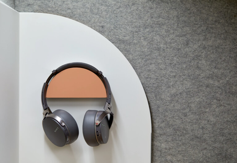
Image

“Long build times are a thing of the past!”
Quote
Indicate a series of related content exists across multiple pages.
Display supplemental information upon click. Please note these are created with HTML and are for developers only.
Preset styles to imply depth on interface components
Small
Standard
Large
Navigational element responsible for toggling the display of content in a near-by container. Please note these are created with HTML and are for developers only.
Home Tab Content
Profile Tab Content
Contact Tab Content
Home Tab Content
Profile Tab Content
Contact Tab Content
Home Tab Content
Profile Tab Content
Contact Tab Content
Home Tab Content
Profile Tab Content
Contact Tab Content
Home Tab Content
Profile Tab Content
Contact Tab Content
Display supplemental information upon hover. Please note these are created with HTML and are for developers only.